Did a 30 day bicycle tour make me more fit?

TLDR: Yes, it made me more fit. Scroll down to see an animation and a derived equation.
Last month, I finished the Tour Aotearoa - a 3000 km bikepacking tour across New Zealand. The cutoff to finish was 30 days. I started on February 21st and finished on March 23rd - 29 days, 23 hours, and 45 minutes later. So I finished a 30 day tour with only 15 minutes to spare.
I knew that the tour would be a challenge. While I'm generally fit and have done some bikepacking trips, including 2 weeks on the GDMBT, I had gained some weight over the past few years and did not have the time to do the prerequisite training (the recommendation was 3000km and I pulled off maybe 200km?).
As I struggled through the first few days, the advice from tour veterans was often some version of, "Don't worry. You'll get fitter. Train into it!" And subjectively, it did seem to get slightly easier as the tour went on. However, did I actually become more fit after riding 3000 km? Was my body in better shape at the end of the tour than it was at the beginning? And, if so, can I measure that?
Vital stats
- 32 years old
- Male since birth
- 182 cm tall
- Moderate but controlled asthma
- ~55 resting heart-rate (middle of the night)
- Riding a 2017 Aluminum Salsa Timberjack with 29er wheels - 13.5 kg bare. Of course I had plenty of gear so let's say 25kg total?
Data collection
During the tour, I wore a Garmin Fenix 5 watch. This recorded my distance, elevation, and heart-rate every few seconds. At the end of each day, the data collected gets synced to Garmin's servers. Later, I was able to download this data in an XML format. In total, I retrieved 187,216 data-points over the 30 days.
Data overview
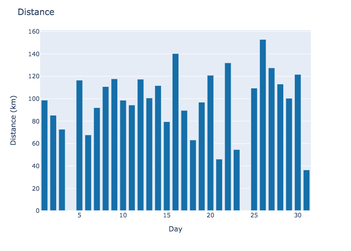
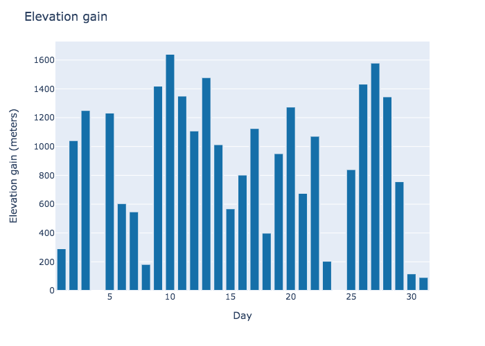
Below is the basic distance and elevation data. There are some discrepancies to note. On day four, my shifter broke and I was stuck waiting for a new one. Then, starting around day 20, I got sick. After four days, that culminated in another rest day on day 24.
Measure of fitness
My middle school gym teacher had a good definition of fitness. In his words, imagine two runners of the same height and weight competing in a 5k. For the entire race, neither runner is ahead of the other. They then finish at the exact same time in a tie. One runner had an average heart-rate of 150 and the other had an average of 155. Who was the more fit runner?
The answer, of course, was the runner who had the lower heart-rate. If your heart works less for the exact same output, you are fitter. And so it is with cycling as well. If I was, in-fact, getting more fit, I would expect my heart-rate to have fallen over the course of the tour. Did that happen?
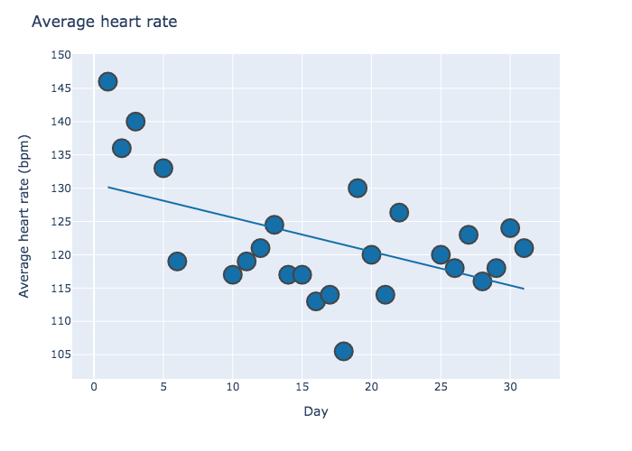
Looking at my average daily heart-rate over the course of the tour, it does appear to decrease. But was my heart-rate decreasing because I was getting more fit or because I was getting lazier? To answer that question, I'll need to compare my heart-rate to how hard I worked.
Cleaning up the data
The Garmin XML files provided four data points: time, distance, elevation, and heart-rate. These are snapshots of exactly one point in time. To make this data useful, I need speeds and grades (as in uphill/downhill grades). To do this, I calculated intervals. So, for example, speed is the change of distance over time.
There is an additional important consideration when working with heart rates. The human heart actually takes time to adjust to the body's current level of exertion. Hence, the calculated intervals must be long enough to capture that adjustment. They can't be too long though. An interval that is too long risks blurring the data. Through experimentation, I found that 90 second intervals worked best (or at least gave me the best r^2!).
Other things I did:
- Dropped all intervals with speeds <5km/hr or >30km/hr (these are either me standing still or the GPS getting wacky)
- Dropped all climbs of > 1m/sec. Again, anything over 1m/second is way past my physical limitation and due to wacky GPS readings
- Dropped all descent intervals. Gravity - not muscle - is the primary force on descents. They are not useful for this analysis.
Naive first-pass
As a first pass, when I compare heart-rate to speed, I get a downward sloping trend. Why is this? Why would I have a slower heart-rate the faster I go?
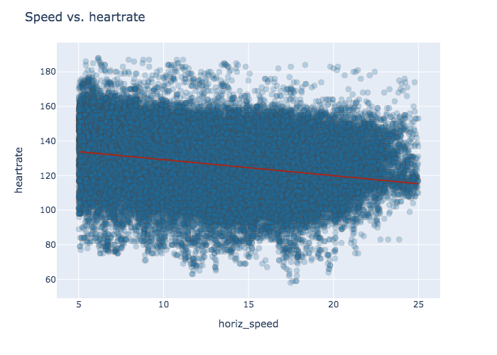
It turns out that when I'm going slow, chances are good that I'm actually going up a hill and working harder. Indeed, a plot of speed vs grade reveals a strong relationship.
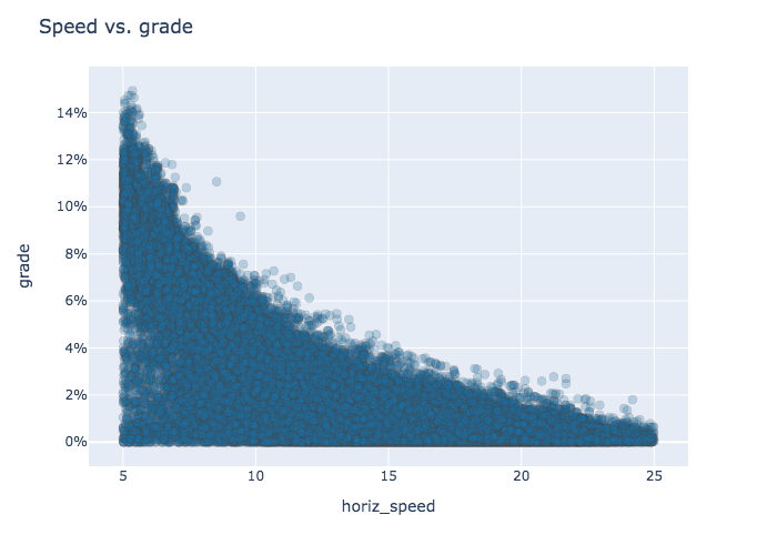
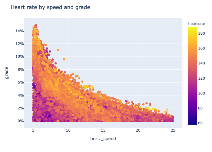
Including heart-rate on a heat-map suggests that the heart-rate is highest near the top of the distribution. This is when I'm traveling both fast and uphill. And this makes sense.
Constant output model
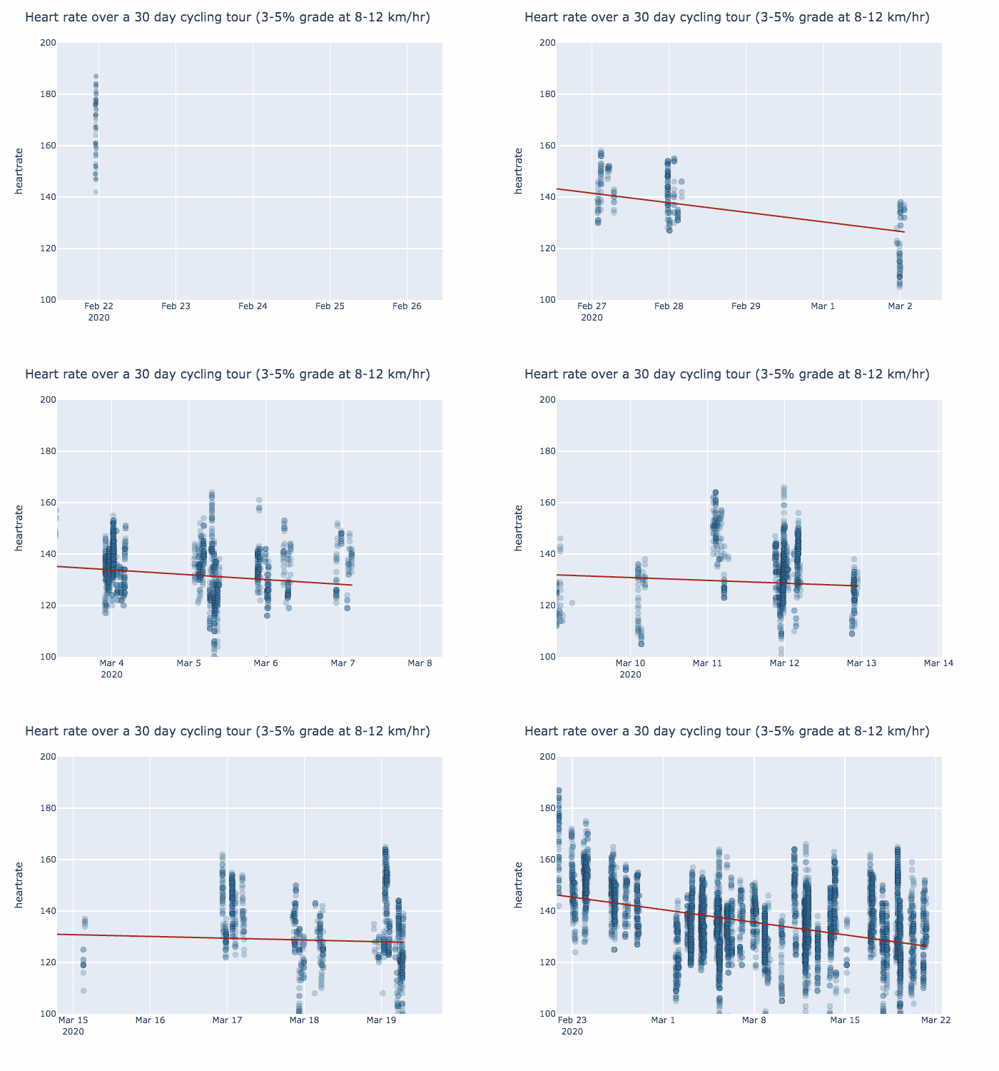
So did I become more fit over the course of the tour? Did my heart beat slower for the same output? Well, if I hold both my speed and grade constant at 8-12 km/hr and 3-5% grade, I find an obvious downward trend. Estimating from the animation below, my heart beat 20 bpm slower on day 30 than on day one!
Adjustments and multivariate model
The animation is good but can I do better? Can I use all of my data instead of just a narrow 8-12 km/hr, 3-5% grade range? Can I get precise numbers? Of course I can. I can use a multivariate model!
heartrate = a*speed + b*grade + c*day
Running this through sklearn's LinearRegression implementation for all 89,238 intervals I get an r^2 of 0.27. Using the calculated coefficients provides the equation below...
heartrate = .77*speed + 344.49*grade - 0.50*day + 116.61
What else can I tweak? One thing you might notice from the animation is that the first three days appear to be outliers in the data. One contributing factor to that may be that I had different tires on my first three days. When I got my shifter fixed on day 4, I also decided that the tires I was riding with, which were enduro tires, were too heavy and I replaced them. After removing the first three days of data, the r^2 was about the same at .26 and the new equation is below
heartrate = .83*speed + 365.81*grade - 0.19*day + 116.61
Looking at the coefficient for "day", I see -0.19. Everyday on the tour, my heart-rate dropped about .2 beats/minute for the same level of exertion. That suggests a total improvement of 6 BPM! This is not as dramatic as suggested from the animation (~20BPM) but it is more precise and is still a good result!

Open data
My code and raw data is available on Github. Thanks for reading!